Colors

The Need For Blooms

Happy Monday All!

Every Winter, usually in January I have a desperate need to have fresh flowers in the house. Don't get me wrong there is never a bad time to have fresh blooms in the house but in the cold it's a must.  I certainly won't pretend to be a florist because those people are down right talented. But for those of us who just want something pretty to look at here are some tips for making your arrangement very pleasing to the eye.  

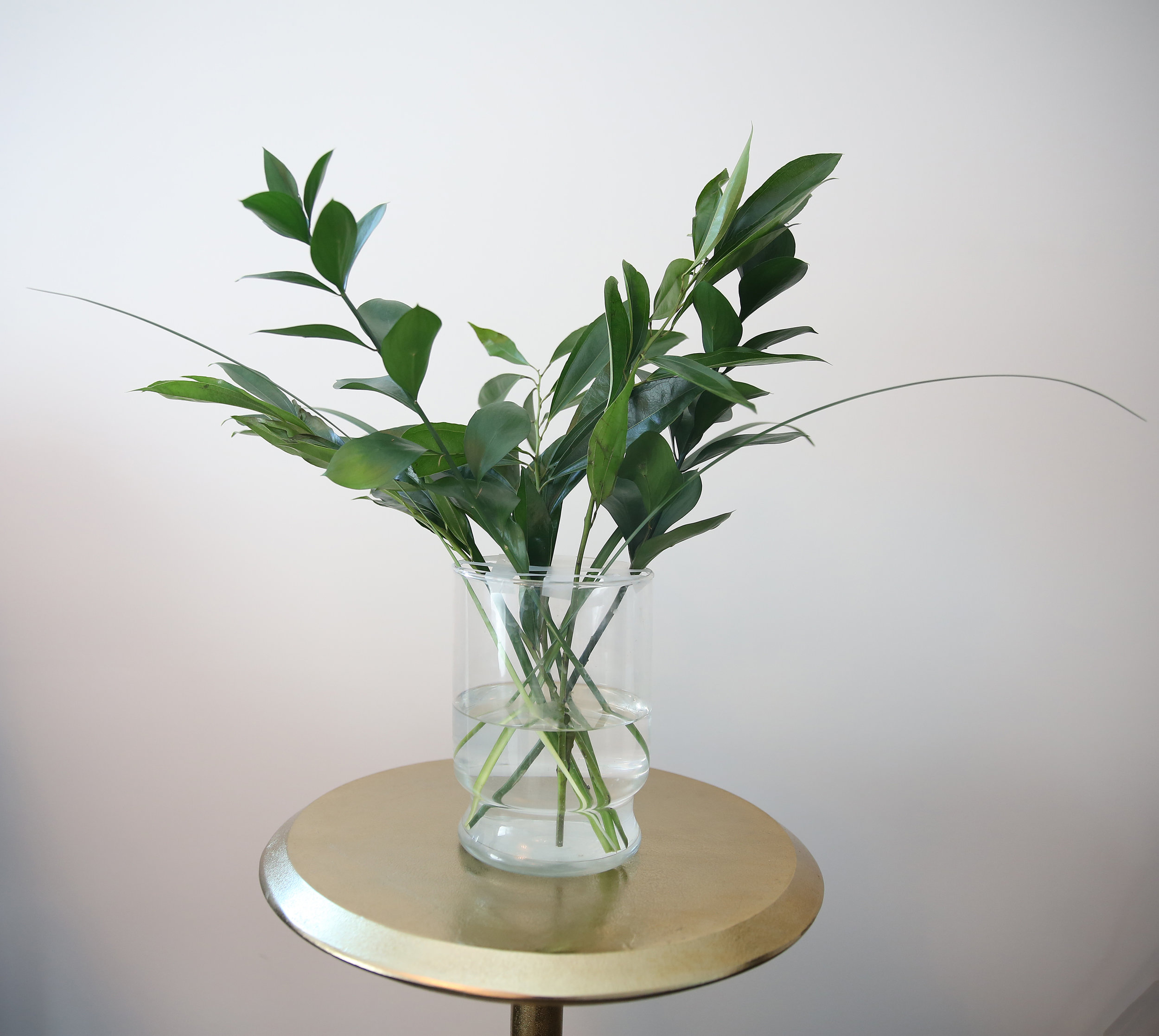
First get your chosen vase and using regular scotch tape make vertical and horizontal lines about an inch or two apart depending on the size of your vase. 

Greens are the nest step. Choose your fillers and start placing them in your grid randomly. 

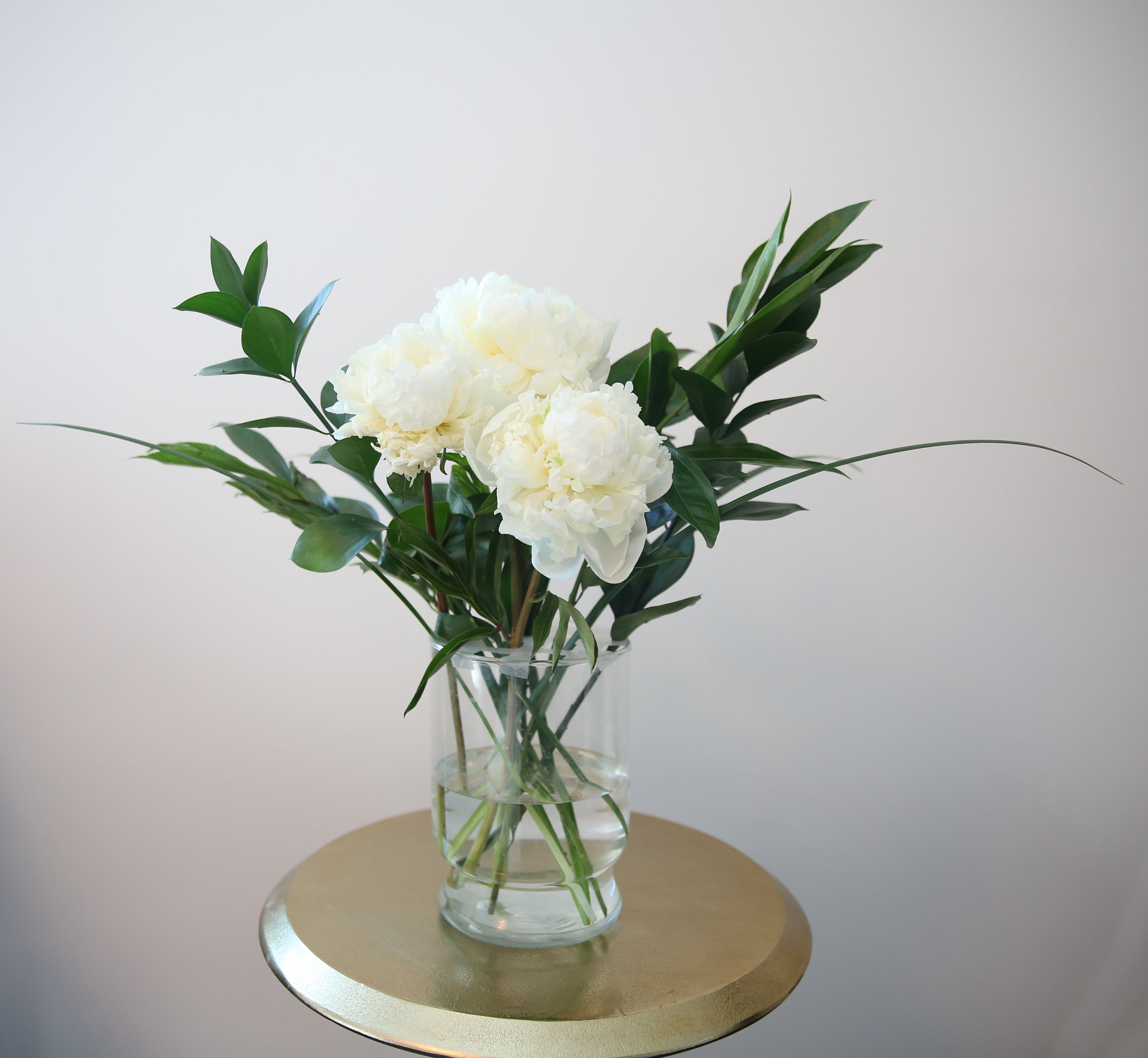
Make sure you always trim your stems on an angle. This makes it easier for the flowers to drink the water. Also when trimming hold the flower next to the vase so that you can see where it will hit. Your "Face Flowers" are next. These are the big super pretty ones. Pick three or five. Try to picture where they will go in your arrangement. Cut them at different heights so that there is dimension. Keep spinning your vase to decide which way looks better to you.  

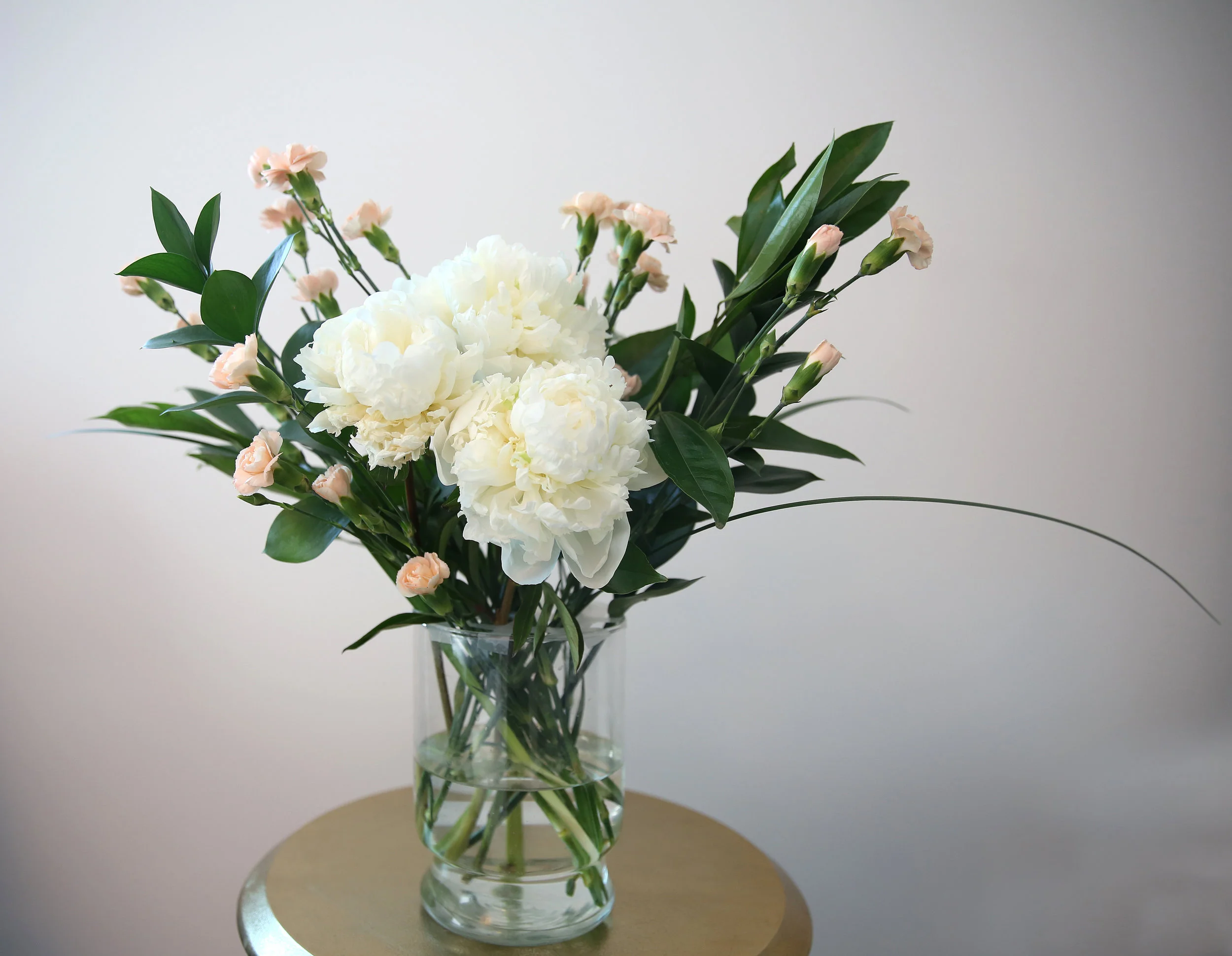
Next is accent flowers, use a lot or a little. I used complimentary colors (opposite side of the color wheel).

Fill in any and extra space with your greenery or more accent flowers.  

Fast Tip: You can cover the walls of the vase with greenery or make sure you clean off the bottom of the stems and crisscross them for a more polished look.

I hope your coffee is extra hot on this freezing day!

xoxo  

Gorgeous Greenery

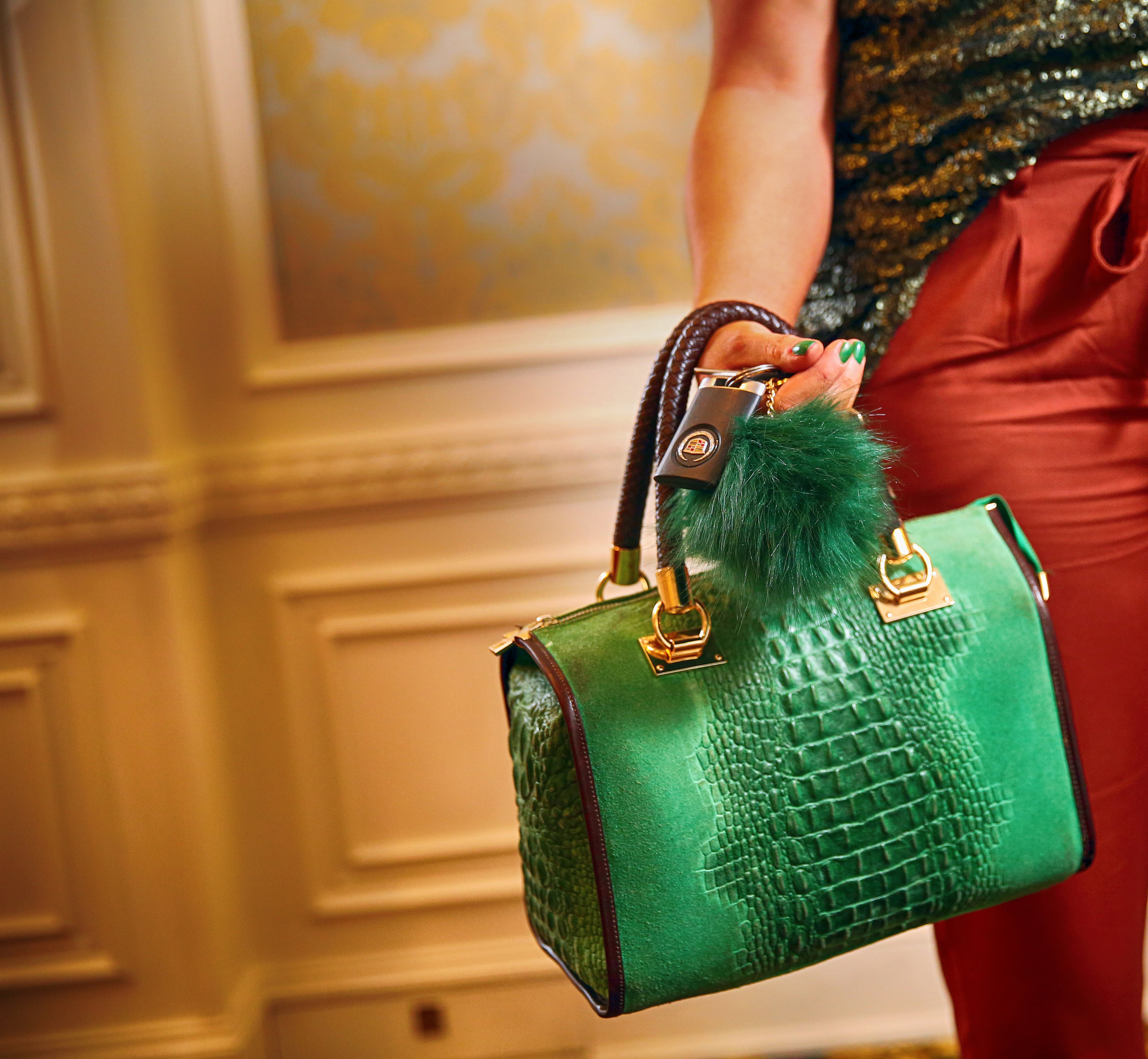
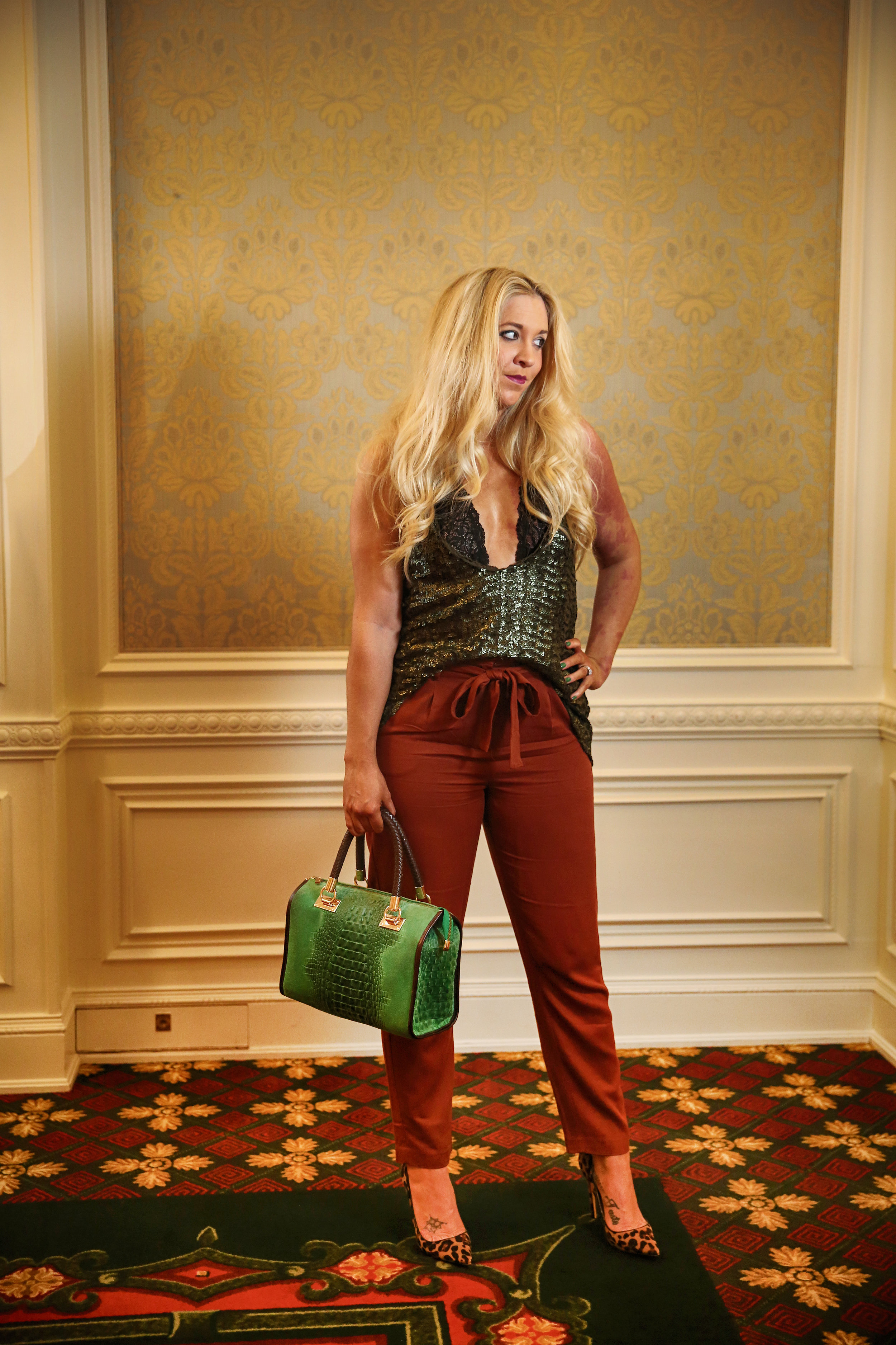
By now I'm sure that most of you have heard Pantone's the color of 2017 is "Greenery". I normally do a post about this yearly announcement but this year I'm just as thrilled as when it was Emerald in 2013. Green is my most favorite color! Even "Kale" made it's way into the 2017 Spring color palette! Which I decided to rock with a little added sparkle!  

I think it's so funny and very hipster to throw kale into spring's colors but I love it!  

I do adore a great color combo and also tend to pair on opposite sides of the color wheel. Burnt Orange and Kale are a match made in heaven. Add a little leopard and you've got a great outfit. 

I don't know about you but I for one am very excited to welcome a new year and new fashion possibilites. Here is Pantone's Spring 2017 color palette.

Who's ready to start shopping?

IMG_2299.JPG

I've got a lot of fun things in store for you this week. Look for delicious recipes, and a very sparkly DIY on Friday's Martini Moment.

Have a great week leading up to Christmas! I hope your coffee is strong and your shopping is done!

xoxo

Pink Is Always In Season

It's no secret that I love shoes with a deep passion of my soul and...sole. Haha! In my post "Time For A Dip?" I showcased my fabulous blue shoes. Well I loved them so much I decided my life just wasn't complete without the same one's in pink. 

image.jpg

Keeping this post short and sweet I've made a fast color guide for this fabulous pink color that will carry me through Spring. These are a few of my favorite pink color combo's. 

  • Pink and Navy
  • Pink and Green
  • Pink and Red
  • Pink and Grey
image.jpg

I was also in need of a new scent to so that I can switch up my usual Chanel. I went with Lola by Marc Jacobs. I knew I liked it because I've given it as gifts before. I feel like it's a nice inbetween casual and dressy. 

image.jpg

Ready for a Fast Tip? To make your perfume last longer spritz it into your hairbrush and comb through.